Acces File Here
Please note that it may take a moment to load due to the large size of the PDF file
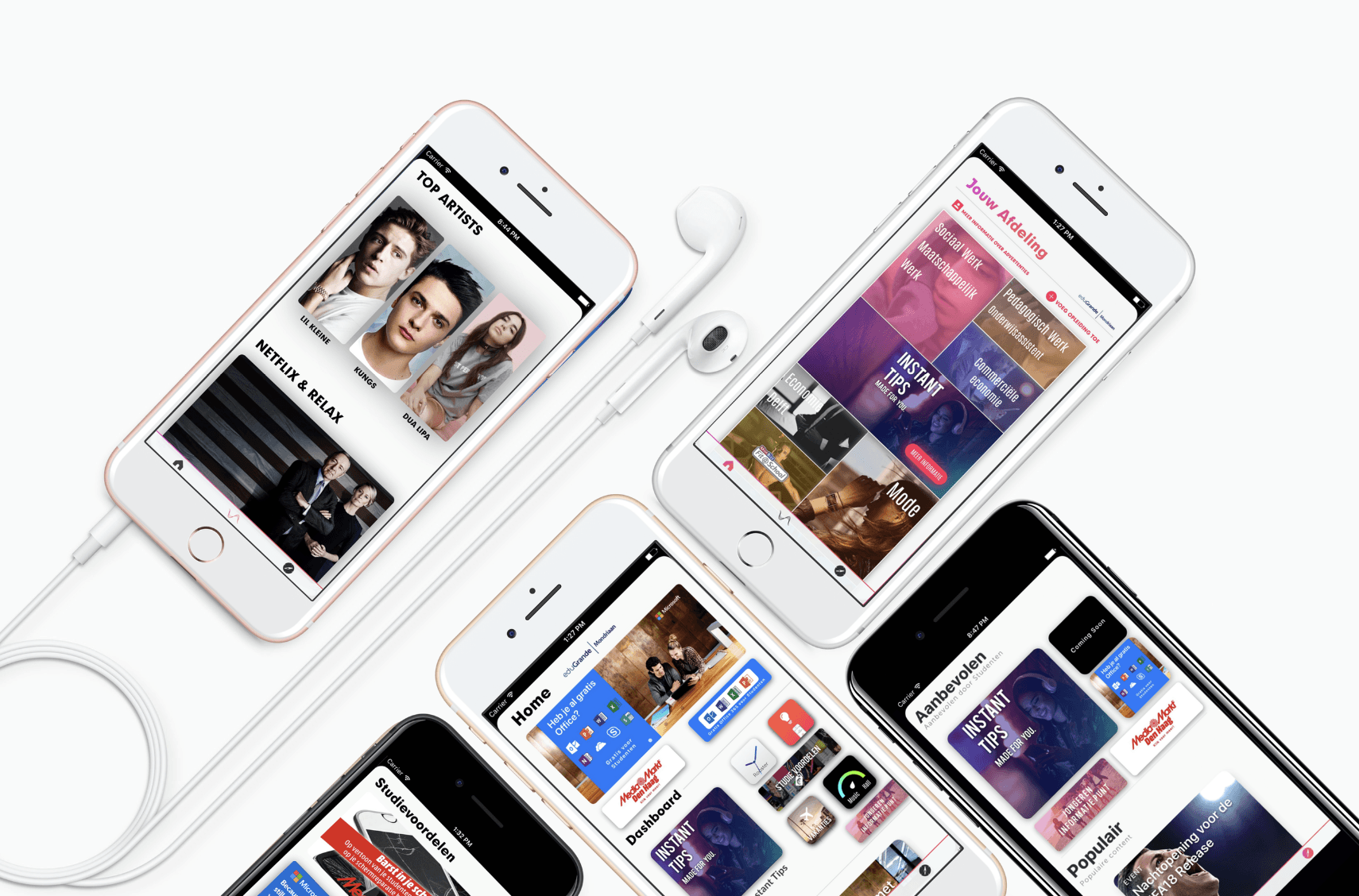
Background Let’s start with some context. Picture this: a university that didn’t have a dedicated app for students. Yeah, I know, sounds like a joke, right? University Mondriaan was in that exact boat. The website was a labyrinth of pages that looked like they hadn't been updated since the dawn of the internet. Want to check your schedule? Good luck. Need a quick link to webmail or resources? Better pack a lunch, because it’s gonna take a while. As a student there, I was living that frustration daily, and I thought, “Wait a minute. Why not build something that actually works?” So, I did.
The Problem University Mondriaan was in desperate need of a unified solution that would gather all the scattered bits and pieces of their online student services. The website wasn’t cutting it. Schedules? Buried in sub-menus. Resources? Hiding somewhere between broken links and pages that refused to load on mobile. Webmail? You guessed it—yet another separate login, like it was trying to win an award for “Most Annoying UX Ever.”
There was no app. Zero. Zilch. And let me tell you, it was like we were living in the digital Stone Age.
The Solution: An App That Didn’t Suck Now, I didn’t just want to build an app; I needed to build an app. For my sanity and the sanity of everyone else drowning in that digital wasteland. So I pulled up Xcode, Sketch, and Figma, and got to work.
This wasn’t some "off-the-shelf" solution. I designed everything from scratch, pulling all the resources students needed into one clean, functional app. Class schedules? One tap away. Webmail? Integrated directly, no more bouncing around like a lost email nomad. And those university resources? All in one place, organized and accessible without having to solve a riddle to find them.
Design Process Here’s the thing about UX design—if you overcomplicate it, you’re just making a bad problem worse. I focused on two key elements: simplicity and efficiency. Students didn’t need a bunch of flashy nonsense, they needed functionality. They needed speed, and they needed it to work on any device—without digging through layers of convoluted design.
So, I approached the design with a user-first mentality. I mocked up the wireframes using Sketch, then prototyped the flows in Figma to test functionality. Every button, every menu, every transition was made to minimize the number of taps and the time spent looking for information. Less is more. Period.
Building with Xcode Developing with Xcode? Oh, it’s a love-hate relationship. There were times I wanted to chuck my Mac out the window, but I pushed through because, hey, the mission was simple: Make this app work for everyone. The UI needed to be fluid, responsive, and, most importantly, user-friendly.
I wrote clean code to keep things smooth, no fancy tricks or bloated features—just what the students needed, no more, no less. The goal was straightforward: create something that made navigating the chaotic digital world of Mondriaan a breeze.
Here’s where things got interesting. Once the app was functional, I figured, why not add a little something extra (and make some bucks out of it?). So I DM'ed Microsoft Netherlands on Twitter (yeah, Twitter, before the car and space guy bought it and renamed it to X) and told them about eduGrande. They said they'd forward the message to the head of Microsoft's education sector. Few days later, I got a call from Microsoft, requesting a meeting to tell them more about this "eduGrande."
I went to their fancy Dutch HQ (fun fact: most were using MacBooks over there, running Windows), and I secured a deal with them. Once I had Microsoft in the bag, I went on to the next partnership with Media Markt.
I secured partnerships with Media Markt and Microsoft Netherlands to bring in student discount coupons directly within the app.
Yeah, I know, it sounds random, but it worked. Students got access to discounts without leaving the app, adding a whole new level of utility.
It was like giving them a cherry on top of an already solid product. I wasn’t just solving the problem of accessing university services—I was adding value beyond the original scope. And let’s face it, who doesn’t love a good deal?The Grind: Handling It Solo This project? Yeah, it was all me. I didn’t have a team, a committee, or a bunch of consultants whispering in my ear. I handled the design, the coding, the outreach to companies, and the promotion. To get the word out, I connected with student organizations, marketed the app myself, and made sure people knew it existed.
It wasn’t easy. Balancing schoolwork and app development was like juggling chainsaws. But once the app was live, the student feedback made it all worth it. People were finally able to access their schedules, resources, and webmail in seconds rather than spending an eternity wading through the archaic university website. Victory.
Challenges and Lessons Learned Okay, so here’s the part where I could give you some sort of inspiring lesson about overcoming challenges. But let’s cut the fluff. Was it hard? Yeah. Did I run into obstacles? Absolutely.
The first big hurdle was integrating with the university’s backend systems. There’s nothing quite like the joy of dealing with outdated infrastructure that feels like it was held together by chewing gum and paper clips. The second challenge was maintaining a balance between functionality and keeping the app lightweight. Some features got scrapped because I wasn’t about to turn this thing into a slow, bloated mess.
And the outreach? It’s one thing to build an app; it’s another to convince people to use it. I had to market this like I was selling the latest iPhone. I was my own hype-man, pushing the app to student groups, creating buzz, and ensuring that the launch didn’t flop.
I learned that simplicity wins. People don’t want a million features—they want a few that work well. This was a user-first design, and keeping that as my guiding principle made everything else easier. Don’t overthink it; solve the problem. That’s the UX gospel right there.
Impact The app was a hit—at least, until the university finally got its act together and replaced it with their own platform. But in its prime, the app saved students from endless headaches, making their university experience just a little bit easier.
Was it perfect? Nah. But it worked, and sometimes that’s enough.
Students no longer had to wade through the digital swamp of the university website. They had what they needed at their fingertips, in an interface that didn’t make them want to throw their phones out the window. I’d say that’s a win.
Final Thoughts In the end, this project wasn’t just about creating an app. It was about solving a real problem—one that I had firsthand experience with—and creating something that made life easier for hundreds of students. And honestly? That’s the best kind of project.
Sure, the university eventually replaced it with their own shiny platform, but this app filled a gap when it was desperately needed. I’m proud of that. It taught me the value of a well-designed user experience and the power of building something that people actually need.
So yeah, this was more than just another student project. It was my way of saying, “Here, take this thing that actually works.” And for a while, that’s exactly what it did.
Acces File Here
Please note that it may take a moment to load due to the large size of the PDF file


